
Overview
Creating Siftr’s Landing Page
At Kennesaw State University's 2024 Design-A-Thon, I teamed up with Christine Taylor and clinched 1st place by tackling Siftr’s challenge: Design the landing page of their site with the main purpose of getting users to download the Siftr app. In just one week, Christine and I designed and developed a landing page for both web and mobile that effectively directs users to download the Siftr app while establishing a strong brand image and a compelling hook to give users a reason to download the app.
Design-A-Thon Kickoff
Siftr is a mobile app designed to help TV and movie watchers find and decide on titles that fits their taste. Siftr utilizes its “archetype quiz” to offer users personalized recommendations and connects them with others who share similar tastes, facilitating their search for the next thing to watch.
Who Is Siftr and What Is Challenge?
Siftr App Mockups
What Will We Be Designing?
Design Challenge: Design and develop a responsive landing page for Siftr that communicates its brand while driving app downloads.
Key Messages the site should drive:
Efficiency - Siftr cuts through overwhelming content, saving users from wasting time on mediocre titles.
Guidance - Siftr acts as a guide, not the hero, directing users to content they’ll truly love.
Ease - Siftr helps users dive straight into something enjoyable without endless searching.
Design
From Zero to Live in Four Days
With the goals and brand messaging clearly defined, the focus shifted to translating these insights into a tangible design, moving the work into Figma to begin building the landing page.
First, we created a small style guide from the provided brand assets to help us maintain consistency with Siftr’s branding.
Style Guide
Siftr Style Guide (Figma)
Next, we researched landing pages focused on app downloads, analyzing their layouts, messaging, and visuals. From this, we curated examples into an inspiration board to guide our design decisions.
Benchmarking
Inspiration Board (Figma)
With the style guide and inspiration board in place, we got into the nitty-gritty and started creating screens in Figma. The image below shows the evolution from the initial concepts (top left) to the versions that moved closer to the final design (bottom right).
Designing
Design Evolution (Figma)
After finalizing the Figma designs, I brought them to life as a responsive website in Webflow. The layouts, typography, and interactions were translated into Weblfow, ensuring the site functioned smoothly across all screen sizes while staying true to the original design.
Developing
Siftr Landing Page (Webflow)
Final Website
In less than four days, we completed the design challenge by creating a fully responsive landing page for that clearly communicates the brand messaging and focuses on driving app downloads.
The First Place Product
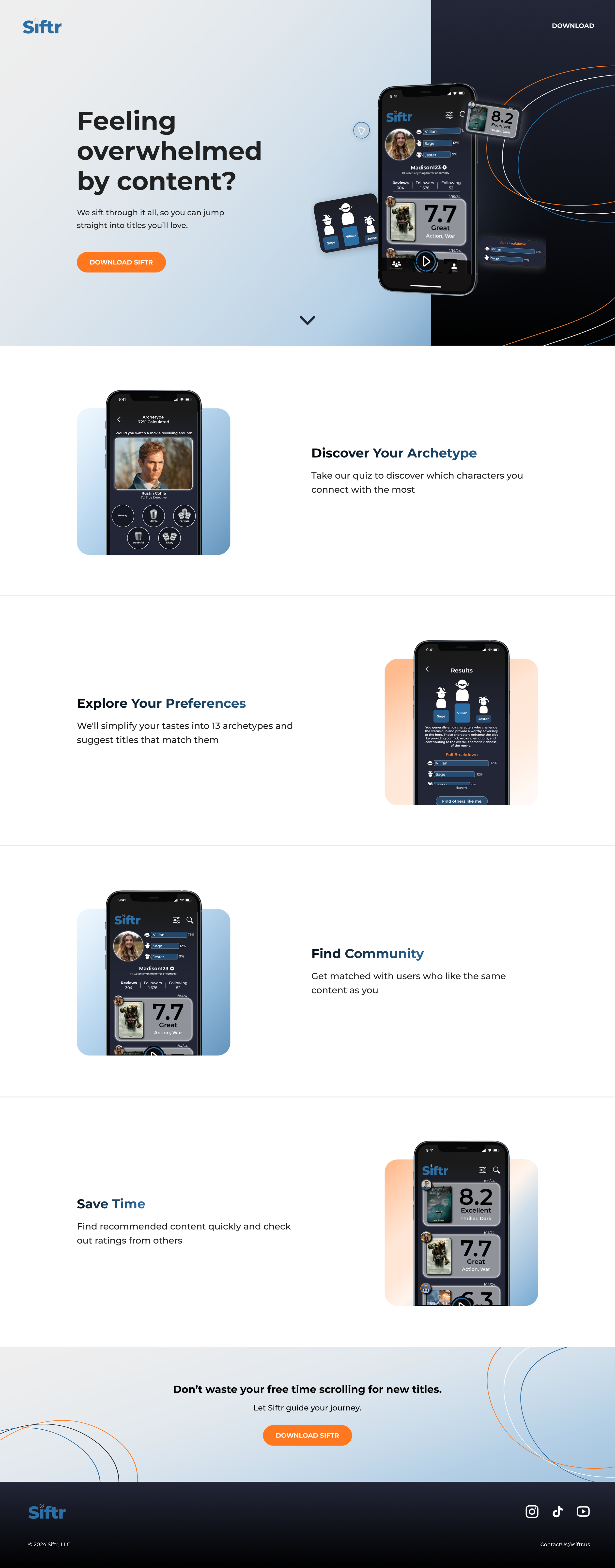
Siftr Landing Page (Final)
Reflection
Reflecting on the Design-A-Thon Experience
This design-a-thon was a great opportunity to tackle a real project under tight deadlines to deliver a clear, focused brand experience. This process emphasized rapid iteration, quick decision-making, and adapting based on feedback.
We wrapped up the event by presenting to senior designers, where the Q&A reinforced the value of communicating design choices clearly. Overall, the experience strengthened my skills in creating focused, responsive, and user-centered web experiences.
There were many lessons that I learned throughout this experience. Here are some examples of these lessons:
Communication isn’t optional - With such a short deadline, staying in constant communication with my partner was crucial to move quickly and make effective decisions.
Be able to defend your design - Presenting to senior designers reinforced the importance of being able to clearly explain and stand by your design choices.
Clarity is key - Focusing on clear messaging and intuitive layouts showed me that the best designs guide users effortlessly.
Lessons Learned
~ fin ~
Like what you saw? Check out more of my work ↓

